 Poyraz Avsever
ffc6c65db1
Poyraz Avsever
ffc6c65db1
- Added poyraz-ui preset CSS import to globals.css for styling.
- Created theme-switcher.md documentation for reactive-switcher usage.
- Added usage-guide.md for comprehensive Poyraz UI instructions.
- Updated package.json to include reactive-switcher as a dependency.
- Modified pnpm-lock.yaml to reflect the addition of reactive-switcher.
- Established themes.ts to export Poyraz UI themes for use in the application.
934 lines
22 KiB
Markdown
934 lines
22 KiB
Markdown
<p align="center">
|
||
<img src="./public/logo/Logo.png" alt="Reactive Switcher Logo" width="180" />
|
||
</p>
|
||
|
||
<h1 align="center">Reactive Switcher</h1>
|
||
|
||
<p align="center">
|
||
<strong>Type-safe, modular, and instant theme switching for React & Tailwind CSS v4</strong>
|
||
</p>
|
||
|
||
<p align="center">
|
||
<a href="https://www.npmjs.com/package/reactive-switcher">
|
||
<img src="https://badge.fury.io/js/reactive-switcher.svg" alt="npm version" />
|
||
</a>
|
||
<a href="https://opensource.org/licenses/MIT">
|
||
<img src="https://img.shields.io/badge/License-MIT-yellow.svg" alt="License: MIT" />
|
||
</a>
|
||
<a href="https://github.com/poyrazavsever/reactive-switcher">
|
||
<img src="https://img.shields.io/badge/TypeScript-100%25-blue.svg" alt="TypeScript" />
|
||
</a>
|
||
<a href="https://bundlephobia.com/package/reactive-switcher">
|
||
<img src="https://img.shields.io/bundlephobia/minzip/reactive-switcher" alt="Bundle Size" />
|
||
</a>
|
||
</p>
|
||
|
||
<p align="center">
|
||
<a href="#-features">Features</a> •
|
||
<a href="#-installation">Installation</a> •
|
||
<a href="#-quick-start">Quick Start</a> •
|
||
<a href="#-api-reference">API</a> •
|
||
<a href="#-demo">Demo</a> •
|
||
<a href="#türkçe">Türkçe</a>
|
||
</p>
|
||
|
||
---
|
||
|
||
## ✨ Features
|
||
|
||
- 🚀 **Zero Runtime Overhead** - Uses CSS variables for instant theme switching
|
||
- 📦 **TypeScript First** - Full type safety with autocomplete support
|
||
- 🎨 **Tailwind CSS v4 Ready** - Seamless integration with the new engine
|
||
- 💾 **Persistent Themes** - LocalStorage support out of the box
|
||
- 🌙 **System Theme Detection** - Respects `prefers-color-scheme`
|
||
- ⚡ **No Flash** - SSR compatible with hydration flash prevention
|
||
- 🎯 **Scoped Theming** - Apply different themes to different parts of your app
|
||
- 🧩 **Ready-to-use Components** - `ThemeSwitcher` and `ThemeToggle` included
|
||
|
||
---
|
||
|
||
## 📦 Installation
|
||
|
||
```bash
|
||
npm install reactive-switcher
|
||
# or
|
||
pnpm add reactive-switcher
|
||
# or
|
||
yarn add reactive-switcher
|
||
```
|
||
|
||
---
|
||
|
||
## 🚀 Quick Start
|
||
|
||
### 1. Define Your Themes
|
||
|
||
```typescript
|
||
// themes.ts
|
||
import { ThemesConfig } from "reactive-switcher";
|
||
|
||
export const themes: ThemesConfig = {
|
||
light: {
|
||
name: "light",
|
||
type: "light",
|
||
colors: {
|
||
background: "#ffffff",
|
||
foreground: "#0f172a",
|
||
primary: {
|
||
DEFAULT: "#3b82f6",
|
||
foreground: "#ffffff",
|
||
50: "#eff6ff",
|
||
500: "#3b82f6",
|
||
600: "#2563eb",
|
||
},
|
||
secondary: {
|
||
DEFAULT: "#64748b",
|
||
foreground: "#ffffff",
|
||
},
|
||
surface: {
|
||
50: "#f8fafc",
|
||
100: "#f1f5f9",
|
||
200: "#e2e8f0",
|
||
},
|
||
},
|
||
},
|
||
dark: {
|
||
name: "dark",
|
||
type: "dark",
|
||
colors: {
|
||
background: "#020617",
|
||
foreground: "#f8fafc",
|
||
primary: {
|
||
DEFAULT: "#60a5fa",
|
||
foreground: "#0f172a",
|
||
},
|
||
secondary: {
|
||
DEFAULT: "#94a3b8",
|
||
foreground: "#0f172a",
|
||
},
|
||
surface: {
|
||
50: "#0f172a",
|
||
100: "#1e293b",
|
||
200: "#334155",
|
||
},
|
||
},
|
||
},
|
||
};
|
||
```
|
||
|
||
### 2. Wrap Your App with ThemeProvider
|
||
|
||
```tsx
|
||
// app/layout.tsx (Next.js)
|
||
import { ThemeProvider } from "reactive-switcher";
|
||
import { themes } from "./themes";
|
||
|
||
export default function RootLayout({ children }) {
|
||
return (
|
||
<html lang="en" suppressHydrationWarning>
|
||
<body>
|
||
<ThemeProvider themes={themes} defaultTheme="light">
|
||
{children}
|
||
</ThemeProvider>
|
||
</body>
|
||
</html>
|
||
);
|
||
}
|
||
```
|
||
|
||
### 3. Use the Theme
|
||
|
||
```tsx
|
||
"use client";
|
||
import { useTheme, ThemeToggle } from "reactive-switcher";
|
||
|
||
export function Header() {
|
||
const { theme, setTheme, toggleTheme } = useTheme();
|
||
|
||
return (
|
||
<header className="bg-background text-foreground">
|
||
<p>Current Theme: {theme}</p>
|
||
|
||
{/* Ready-to-use toggle */}
|
||
<ThemeToggle />
|
||
|
||
{/* Or manual control */}
|
||
<button onClick={() => setTheme("dark")}>Dark</button>
|
||
<button onClick={toggleTheme}>Toggle</button>
|
||
</header>
|
||
);
|
||
}
|
||
```
|
||
|
||
### 4. Configure Tailwind CSS v4
|
||
|
||
```css
|
||
/* globals.css */
|
||
@import "tailwindcss";
|
||
|
||
@theme {
|
||
--color-background: var(--color-background);
|
||
--color-foreground: var(--color-foreground);
|
||
--color-primary: var(--color-primary-DEFAULT);
|
||
--color-primary-foreground: var(--color-primary-foreground);
|
||
--color-secondary: var(--color-secondary-DEFAULT);
|
||
--color-surface-50: var(--color-surface-50);
|
||
--color-surface-100: var(--color-surface-100);
|
||
--color-surface-200: var(--color-surface-200);
|
||
}
|
||
|
||
@layer base {
|
||
body {
|
||
background-color: var(--color-background);
|
||
color: var(--color-foreground);
|
||
transition: background-color 0.3s, color 0.3s;
|
||
}
|
||
}
|
||
```
|
||
|
||
---
|
||
|
||
## 📖 API Reference
|
||
|
||
### ThemeProvider Props
|
||
|
||
| Prop | Type | Default | Description |
|
||
| --------------- | ------------------------- | ---------------------------- | ------------------------------- |
|
||
| `themes` | `ThemesConfig` | **required** | Theme configurations object |
|
||
| `defaultTheme` | `string` | `"light"` | Initial theme name |
|
||
| `enableStorage` | `boolean` | `true` | Persist theme to localStorage |
|
||
| `storageKey` | `string` | `"reactive-switcher-theme"` | localStorage key |
|
||
| `enableSystem` | `boolean` | `true` | Detect system color scheme |
|
||
| `selector` | `string` | `":root"` | CSS selector for scoped theming |
|
||
| `styleId` | `string` | `"reactive-switcher-styles"` | Style tag ID |
|
||
| `attribute` | `"class" \| "data-theme"` | `"class"` | HTML attribute for theme |
|
||
|
||
### useTheme() Hook
|
||
|
||
```typescript
|
||
const {
|
||
theme, // Current theme name (string)
|
||
resolvedTheme, // Actual theme (resolves "system")
|
||
setTheme, // (name: string) => void
|
||
toggleTheme, // () => void - Cycle through themes
|
||
themes, // Available theme names (string[])
|
||
systemTheme, // System preference ("light" | "dark")
|
||
} = useTheme();
|
||
```
|
||
|
||
### Built-in Components
|
||
|
||
```tsx
|
||
import { ThemeSwitcher, ThemeToggle } from "reactive-switcher";
|
||
|
||
// Dropdown/Button switcher with multiple variants
|
||
<ThemeSwitcher variant="buttons" /> // Side-by-side buttons
|
||
<ThemeSwitcher variant="dropdown" /> // Dropdown menu
|
||
<ThemeSwitcher variant="toggle" /> // Toggle button
|
||
|
||
// Simple two-theme toggle
|
||
<ThemeToggle />
|
||
```
|
||
|
||
---
|
||
|
||
## 🎯 Advanced Usage
|
||
|
||
### Scoped Theming
|
||
|
||
Apply different themes to different parts of your app:
|
||
|
||
```tsx
|
||
import { ThemeProvider } from "reactive-switcher";
|
||
import { themes } from "./themes";
|
||
|
||
function App() {
|
||
return (
|
||
<ThemeProvider themes={themes} defaultTheme="light">
|
||
<main>Main content with light theme</main>
|
||
|
||
{/* Scoped dark theme section */}
|
||
<ThemeProvider
|
||
themes={themes}
|
||
defaultTheme="dark"
|
||
selector="#preview-panel"
|
||
enableStorage={false}
|
||
>
|
||
<div id="preview-panel">This section has its own theme!</div>
|
||
</ThemeProvider>
|
||
</ThemeProvider>
|
||
);
|
||
}
|
||
```
|
||
|
||
### Custom Color Palettes
|
||
|
||
Define nested color tokens:
|
||
|
||
```typescript
|
||
const themes: ThemesConfig = {
|
||
ocean: {
|
||
name: "ocean",
|
||
type: "dark",
|
||
colors: {
|
||
background: "#042f2e",
|
||
foreground: "#ccfbf1",
|
||
primary: {
|
||
DEFAULT: "#2dd4bf",
|
||
foreground: "#042f2e",
|
||
50: "#042f2e",
|
||
100: "#115e59",
|
||
200: "#0f766e",
|
||
// ... more shades
|
||
},
|
||
accent: {
|
||
DEFAULT: "#facc15",
|
||
foreground: "#422006",
|
||
},
|
||
},
|
||
},
|
||
};
|
||
```
|
||
|
||
---
|
||
|
||
## 🌐 Demo
|
||
|
||
Check out the live demo: [reactive-switcher.vercel.app](https://reactive-switcher.vercel.app)
|
||
|
||
---
|
||
|
||
## 🤝 Contributing
|
||
|
||
Contributions are welcome! Please feel free to submit a Pull Request.
|
||
|
||
1. Fork the repository
|
||
2. Create your feature branch (`git checkout -b feature/amazing-feature`)
|
||
3. Commit your changes (`git commit -m 'Add some amazing feature'`)
|
||
4. Push to the branch (`git push origin feature/amazing-feature`)
|
||
5. Open a Pull Request
|
||
|
||
---
|
||
|
||
## 📄 License
|
||
|
||
MIT © [Poyraz Avsever](https://github.com/poyrazavsever)
|
||
|
||
---
|
||
|
||
<br />
|
||
|
||
# Türkçe
|
||
|
||
<p align="center">
|
||
<strong>React ve Tailwind CSS v4 için tip güvenli, modüler ve anlık tema değiştirici</strong>
|
||
</p>
|
||
|
||
---
|
||
|
||
## ✨ Özellikler
|
||
|
||
- 🚀 **Sıfır Çalışma Zamanı Yükü** - Anlık tema değişimi için CSS değişkenleri kullanır
|
||
- 📦 **TypeScript Öncelikli** - Otomatik tamamlama desteği ile tam tip güvenliği
|
||
- 🎨 **Tailwind CSS v4 Uyumlu** - Yeni motor ile kusursuz entegrasyon
|
||
- 💾 **Kalıcı Temalar** - Kutudan çıktığı gibi localStorage desteği
|
||
- 🌙 **Sistem Teması Algılama** - `prefers-color-scheme` tercihine uyar
|
||
- ⚡ **Yanıp Sönme Yok** - SSR uyumlu, hidrasyon flash önleme
|
||
- 🎯 **Kapsamlı Tema** - Uygulamanızın farklı bölümlerine farklı temalar uygulayın
|
||
- 🧩 **Kullanıma Hazır Bileşenler** - `ThemeSwitcher` ve `ThemeToggle` dahil
|
||
|
||
---
|
||
|
||
## 📦 Kurulum
|
||
|
||
```bash
|
||
npm install reactive-switcher
|
||
# veya
|
||
pnpm add reactive-switcher
|
||
# veya
|
||
yarn add reactive-switcher
|
||
```
|
||
|
||
---
|
||
|
||
## 🚀 Hızlı Başlangıç
|
||
|
||
### 1. Temalarınızı Tanımlayın
|
||
|
||
```typescript
|
||
// themes.ts
|
||
import { ThemesConfig } from "reactive-switcher";
|
||
|
||
export const themes: ThemesConfig = {
|
||
light: {
|
||
name: "light",
|
||
type: "light",
|
||
colors: {
|
||
background: "#ffffff",
|
||
foreground: "#0f172a",
|
||
primary: {
|
||
DEFAULT: "#3b82f6",
|
||
foreground: "#ffffff",
|
||
50: "#eff6ff",
|
||
500: "#3b82f6",
|
||
600: "#2563eb",
|
||
},
|
||
secondary: {
|
||
DEFAULT: "#64748b",
|
||
foreground: "#ffffff",
|
||
},
|
||
surface: {
|
||
50: "#f8fafc",
|
||
100: "#f1f5f9",
|
||
200: "#e2e8f0",
|
||
},
|
||
},
|
||
},
|
||
dark: {
|
||
name: "dark",
|
||
type: "dark",
|
||
colors: {
|
||
background: "#020617",
|
||
foreground: "#f8fafc",
|
||
primary: {
|
||
DEFAULT: "#60a5fa",
|
||
foreground: "#0f172a",
|
||
},
|
||
secondary: {
|
||
DEFAULT: "#94a3b8",
|
||
foreground: "#0f172a",
|
||
},
|
||
surface: {
|
||
50: "#0f172a",
|
||
100: "#1e293b",
|
||
200: "#334155",
|
||
},
|
||
},
|
||
},
|
||
};
|
||
```
|
||
|
||
### 2. Uygulamanızı ThemeProvider ile Sarmalayın
|
||
|
||
```tsx
|
||
// app/layout.tsx (Next.js)
|
||
import { ThemeProvider } from "reactive-switcher";
|
||
import { themes } from "./themes";
|
||
|
||
export default function RootLayout({ children }) {
|
||
return (
|
||
<html lang="tr" suppressHydrationWarning>
|
||
<body>
|
||
<ThemeProvider themes={themes} defaultTheme="light">
|
||
{children}
|
||
</ThemeProvider>
|
||
</body>
|
||
</html>
|
||
);
|
||
}
|
||
```
|
||
|
||
### 3. Temayı Kullanın
|
||
|
||
```tsx
|
||
"use client";
|
||
import { useTheme, ThemeToggle } from "reactive-switcher";
|
||
|
||
export function Header() {
|
||
const { theme, setTheme, toggleTheme } = useTheme();
|
||
|
||
return (
|
||
<header className="bg-background text-foreground">
|
||
<p>Aktif Tema: {theme}</p>
|
||
|
||
{/* Kullanıma hazır toggle */}
|
||
<ThemeToggle />
|
||
|
||
{/* Veya manuel kontrol */}
|
||
<button onClick={() => setTheme("dark")}>Koyu</button>
|
||
<button onClick={toggleTheme}>Değiştir</button>
|
||
</header>
|
||
);
|
||
}
|
||
```
|
||
|
||
### 4. Tailwind CSS v4 Yapılandırması
|
||
|
||
```css
|
||
/* globals.css */
|
||
@import "tailwindcss";
|
||
|
||
@theme {
|
||
--color-background: var(--color-background);
|
||
--color-foreground: var(--color-foreground);
|
||
--color-primary: var(--color-primary-DEFAULT);
|
||
--color-primary-foreground: var(--color-primary-foreground);
|
||
--color-secondary: var(--color-secondary-DEFAULT);
|
||
--color-surface-50: var(--color-surface-50);
|
||
--color-surface-100: var(--color-surface-100);
|
||
--color-surface-200: var(--color-surface-200);
|
||
}
|
||
|
||
@layer base {
|
||
body {
|
||
background-color: var(--color-background);
|
||
color: var(--color-foreground);
|
||
transition: background-color 0.3s, color 0.3s;
|
||
}
|
||
}
|
||
```
|
||
|
||
---
|
||
|
||
## 📖 API Referansı
|
||
|
||
### ThemeProvider Props
|
||
|
||
| Prop | Tip | Varsayılan | Açıklama |
|
||
| --------------- | -------------- | --------------------------- | ----------------------------- |
|
||
| `themes` | `ThemesConfig` | **zorunlu** | Tema yapılandırma objesi |
|
||
| `defaultTheme` | `string` | `"light"` | Başlangıç teması |
|
||
| `enableStorage` | `boolean` | `true` | localStorage'a kaydet |
|
||
| `storageKey` | `string` | `"reactive-switcher-theme"` | localStorage anahtarı |
|
||
| `enableSystem` | `boolean` | `true` | Sistem teması algılama |
|
||
| `selector` | `string` | `":root"` | Kapsamlı tema için CSS seçici |
|
||
|
||
### useTheme() Hook
|
||
|
||
```typescript
|
||
const {
|
||
theme, // Aktif tema adı (string)
|
||
resolvedTheme, // Gerçek tema ("system" çözümlenir)
|
||
setTheme, // (name: string) => void
|
||
toggleTheme, // () => void - Temalar arasında geçiş
|
||
themes, // Mevcut tema adları (string[])
|
||
systemTheme, // Sistem tercihi ("light" | "dark")
|
||
} = useTheme();
|
||
```
|
||
|
||
---
|
||
|
||
## 🌐 Demo
|
||
|
||
Canlı demoyu inceleyin: [reactive-switcher.vercel.app](https://reactive-switcher.vercel.app)
|
||
|
||
---
|
||
|
||
## 🤝 Katkıda Bulunma
|
||
|
||
Katkılarınızı bekliyoruz! Pull Request göndermekten çekinmeyin.
|
||
|
||
1. Repoyu fork edin
|
||
2. Feature branch oluşturun (`git checkout -b feature/harika-ozellik`)
|
||
3. Değişikliklerinizi commit edin (`git commit -m 'Harika özellik ekle'`)
|
||
4. Branch'i push edin (`git push origin feature/harika-ozellik`)
|
||
5. Pull Request açın
|
||
|
||
---
|
||
|
||
## 📄 Lisans
|
||
|
||
MIT © [Poyraz Avsever](https://github.com/poyrazavsever)
|
||
|
||
---
|
||
|
||
[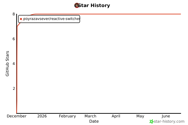](https://www.star-history.com/#poyrazavsever/reactive-switcher&type=date&legend=top-left)
|
||
|
||
<p align="center">
|
||
Made with ❤️ by <a href="https://poyrazavsever.com">Poyraz Avsever</a>
|
||
</p>
|
||
|
||
|
||
---
|
||
|
||
# Reactive Switcher 🎨
|
||
|
||
> Type-safe, modular, and instant theme switching for React & Tailwind CSS v4
|
||
|
||
[](https://www.npmjs.com/package/reactive-switcher)
|
||
[](https://opensource.org/licenses/MIT)
|
||
|
||
## ✨ Features
|
||
|
||
- **Zero Runtime Overhead** - Uses CSS variables for instant theme switching
|
||
- **TypeScript First** - Full type safety with autocomplete support
|
||
- **Tailwind CSS v4 Ready** - Seamless integration with the new engine
|
||
- **Persistent Themes** - LocalStorage support out of the box
|
||
- **System Theme Detection** - Respects `prefers-color-scheme`
|
||
- **No Flash** - SSR compatible with hydration flash prevention
|
||
- **Scoped Theming** - Apply different themes to different parts of your app
|
||
- **Ready-to-use Components** - `ThemeSwitcher` and `ThemeToggle` included
|
||
|
||
## 📦 Installation
|
||
|
||
```bash
|
||
npm install reactive-switcher
|
||
# or
|
||
pnpm add reactive-switcher
|
||
# or
|
||
yarn add reactive-switcher
|
||
```
|
||
|
||
## 🚀 Quick Start
|
||
|
||
### 1. Define Your Themes
|
||
|
||
Create a file to define your theme configurations:
|
||
|
||
```typescript
|
||
// themes.ts
|
||
import { ThemesConfig } from "reactive-switcher";
|
||
|
||
export const themes: ThemesConfig = {
|
||
light: {
|
||
name: "light",
|
||
type: "light",
|
||
colors: {
|
||
background: "#ffffff",
|
||
foreground: "#0f172a",
|
||
primary: {
|
||
DEFAULT: "#3b82f6",
|
||
foreground: "#ffffff",
|
||
50: "#eff6ff",
|
||
100: "#dbeafe",
|
||
500: "#3b82f6",
|
||
600: "#2563eb",
|
||
},
|
||
secondary: {
|
||
DEFAULT: "#64748b",
|
||
foreground: "#ffffff",
|
||
},
|
||
surface: {
|
||
50: "#f8fafc",
|
||
100: "#f1f5f9",
|
||
200: "#e2e8f0",
|
||
},
|
||
},
|
||
},
|
||
dark: {
|
||
name: "dark",
|
||
type: "dark",
|
||
colors: {
|
||
background: "#020617",
|
||
foreground: "#f8fafc",
|
||
primary: {
|
||
DEFAULT: "#60a5fa",
|
||
foreground: "#0f172a",
|
||
50: "#172554",
|
||
100: "#1e3a8a",
|
||
500: "#3b82f6",
|
||
600: "#60a5fa",
|
||
},
|
||
secondary: {
|
||
DEFAULT: "#94a3b8",
|
||
foreground: "#0f172a",
|
||
},
|
||
surface: {
|
||
50: "#0f172a",
|
||
100: "#1e293b",
|
||
200: "#334155",
|
||
},
|
||
},
|
||
},
|
||
};
|
||
```
|
||
|
||
### 2. Wrap Your App with ThemeProvider
|
||
|
||
```tsx
|
||
// app/layout.tsx (Next.js) or main.tsx (Vite)
|
||
import { ThemeProvider } from "reactive-switcher";
|
||
import { themes } from "./themes";
|
||
|
||
export default function RootLayout({ children }) {
|
||
return (
|
||
<html lang="en" suppressHydrationWarning>
|
||
<body>
|
||
<ThemeProvider themes={themes} defaultTheme="light">
|
||
{children}
|
||
</ThemeProvider>
|
||
</body>
|
||
</html>
|
||
);
|
||
}
|
||
```
|
||
|
||
### 3. Use the Theme
|
||
|
||
```tsx
|
||
// components/Header.tsx
|
||
"use client";
|
||
import { useTheme, ThemeToggle } from "reactive-switcher";
|
||
|
||
export function Header() {
|
||
const { theme, setTheme, toggleTheme } = useTheme();
|
||
|
||
return (
|
||
<header className="bg-background text-foreground">
|
||
<h1>Current Theme: {theme}</h1>
|
||
|
||
{/* Option 1: Simple toggle button */}
|
||
<ThemeToggle />
|
||
|
||
{/* Option 2: Manual control */}
|
||
<button onClick={() => setTheme("dark")}>Dark Mode</button>
|
||
<button onClick={() => setTheme("light")}>Light Mode</button>
|
||
<button onClick={() => setTheme("system")}>System</button>
|
||
|
||
{/* Option 3: Cycle through themes */}
|
||
<button onClick={toggleTheme}>Toggle Theme</button>
|
||
</header>
|
||
);
|
||
}
|
||
```
|
||
|
||
### 4. Configure Tailwind CSS v4
|
||
|
||
```css
|
||
/* globals.css */
|
||
@import "tailwindcss";
|
||
|
||
@theme {
|
||
--color-background: var(--color-background);
|
||
--color-foreground: var(--color-foreground);
|
||
|
||
--color-primary: var(--color-primary-DEFAULT);
|
||
--color-primary-foreground: var(--color-primary-foreground);
|
||
--color-primary-50: var(--color-primary-50);
|
||
--color-primary-100: var(--color-primary-100);
|
||
--color-primary-500: var(--color-primary-500);
|
||
--color-primary-600: var(--color-primary-600);
|
||
|
||
--color-secondary: var(--color-secondary-DEFAULT);
|
||
--color-secondary-foreground: var(--color-secondary-foreground);
|
||
|
||
--color-surface-50: var(--color-surface-50);
|
||
--color-surface-100: var(--color-surface-100);
|
||
--color-surface-200: var(--color-surface-200);
|
||
}
|
||
|
||
@layer base {
|
||
body {
|
||
background-color: var(--color-background);
|
||
color: var(--color-foreground);
|
||
transition: background-color 0.3s, color 0.3s;
|
||
}
|
||
}
|
||
```
|
||
|
||
Now you can use Tailwind classes like `bg-primary`, `text-foreground`, `bg-surface-100` etc.
|
||
|
||
---
|
||
|
||
## 📖 API Reference
|
||
|
||
### ThemeProvider
|
||
|
||
The main provider component that wraps your application.
|
||
|
||
```tsx
|
||
<ThemeProvider
|
||
themes={themes} // Required: Your theme configurations
|
||
defaultTheme="light" // Default theme name (default: "light")
|
||
enableStorage={true} // Enable localStorage persistence (default: true)
|
||
storageKey="theme" // localStorage key (default: "reactive-switcher-theme")
|
||
enableSystem={true} // Enable system theme detection (default: true)
|
||
selector=":root" // CSS selector for scoped theming (default: ":root")
|
||
styleId="theme-styles" // Style tag ID (default: "reactive-switcher-styles")
|
||
attribute="class" // HTML attribute: "class" | "data-theme" (default: "class")
|
||
>
|
||
{children}
|
||
</ThemeProvider>
|
||
```
|
||
|
||
### useTheme Hook
|
||
|
||
Access theme state and controls anywhere in your app.
|
||
|
||
```tsx
|
||
const {
|
||
theme, // Current theme name (e.g., "light", "dark", "system")
|
||
resolvedTheme, // Actual theme when "system" is selected
|
||
setTheme, // Function to set theme by name
|
||
toggleTheme, // Function to cycle to next theme
|
||
activeThemeObject, // Full theme object with colors
|
||
themes, // Array of available theme names
|
||
systemTheme, // System preference ("light" | "dark")
|
||
} = useTheme();
|
||
```
|
||
|
||
### ThemeSwitcher Component
|
||
|
||
A ready-to-use theme switcher component with multiple variants.
|
||
|
||
```tsx
|
||
// Buttons variant (default)
|
||
<ThemeSwitcher />
|
||
|
||
// Dropdown variant
|
||
<ThemeSwitcher variant="dropdown" />
|
||
|
||
// Toggle variant (cycles through themes)
|
||
<ThemeSwitcher variant="toggle" />
|
||
|
||
// With custom labels
|
||
<ThemeSwitcher
|
||
labels={{ light: "☀️ Light", dark: "🌙 Dark", system: "💻 System" }}
|
||
/>
|
||
|
||
// Hide labels, show only icons
|
||
<ThemeSwitcher showLabels={false} />
|
||
|
||
// Custom render function
|
||
<ThemeSwitcher>
|
||
{({ theme, setTheme, themes }) => (
|
||
<div>
|
||
{themes.map(t => (
|
||
<button key={t} onClick={() => setTheme(t)}>
|
||
{t}
|
||
</button>
|
||
))}
|
||
</div>
|
||
)}
|
||
</ThemeSwitcher>
|
||
```
|
||
|
||
### ThemeToggle Component
|
||
|
||
A simple light/dark toggle button.
|
||
|
||
```tsx
|
||
// Default
|
||
<ThemeToggle />
|
||
|
||
// Different sizes
|
||
<ThemeToggle size="sm" />
|
||
<ThemeToggle size="md" />
|
||
<ThemeToggle size="lg" />
|
||
|
||
// Custom icons
|
||
<ThemeToggle
|
||
lightIcon={<SunIcon />}
|
||
darkIcon={<MoonIcon />}
|
||
/>
|
||
```
|
||
|
||
---
|
||
|
||
## 🎯 Advanced Usage
|
||
|
||
### Scoped Theming
|
||
|
||
Apply different themes to different parts of your app:
|
||
|
||
```tsx
|
||
// Main app uses light theme
|
||
<ThemeProvider themes={themes} defaultTheme="light">
|
||
<main>
|
||
{/* This section has its own theme */}
|
||
<ThemeProvider
|
||
themes={themes}
|
||
defaultTheme="dark"
|
||
selector="#preview-section"
|
||
styleId="preview-theme"
|
||
enableStorage={false}
|
||
>
|
||
<div id="preview-section">{/* This area will have dark theme */}</div>
|
||
</ThemeProvider>
|
||
</main>
|
||
</ThemeProvider>
|
||
```
|
||
|
||
### Custom Theme Type
|
||
|
||
```typescript
|
||
import { Theme, ThemesConfig } from "reactive-switcher";
|
||
|
||
// Define your custom theme structure
|
||
const myTheme: Theme = {
|
||
name: "ocean",
|
||
type: "dark",
|
||
colors: {
|
||
background: "#042f2e",
|
||
foreground: "#ccfbf1",
|
||
primary: {
|
||
DEFAULT: "#2dd4bf",
|
||
foreground: "#042f2e",
|
||
},
|
||
// Add any custom color tokens
|
||
accent: {
|
||
DEFAULT: "#facc15",
|
||
subtle: "#fef3c7",
|
||
},
|
||
},
|
||
};
|
||
```
|
||
|
||
### System Theme Only
|
||
|
||
```tsx
|
||
<ThemeProvider themes={themes} defaultTheme="system" enableSystem={true}>
|
||
{children}
|
||
</ThemeProvider>
|
||
```
|
||
|
||
---
|
||
|
||
## 🔧 Utility Functions
|
||
|
||
```typescript
|
||
import {
|
||
flattenTheme,
|
||
createCssString,
|
||
getSystemTheme,
|
||
getStoredTheme,
|
||
setStoredTheme,
|
||
} from "reactive-switcher";
|
||
|
||
// Flatten nested colors to CSS variables
|
||
const vars = flattenTheme(theme.colors);
|
||
// { '--color-primary-DEFAULT': '#3b82f6', '--color-primary-500': '#3b82f6' }
|
||
|
||
// Create CSS string
|
||
const css = createCssString(theme);
|
||
// ":root { --color-primary-DEFAULT: #3b82f6; ... }"
|
||
|
||
// Get system preference
|
||
const systemTheme = getSystemTheme(); // 'light' | 'dark'
|
||
|
||
// Storage utilities
|
||
const stored = getStoredTheme("theme-key");
|
||
setStoredTheme("theme-key", "dark");
|
||
```
|
||
|
||
---
|
||
|
||
## 📋 TypeScript Support
|
||
|
||
Full type definitions are included. Enable autocomplete for your theme tokens:
|
||
|
||
```typescript
|
||
import { Theme, ThemesConfig } from 'reactive-switcher';
|
||
|
||
// Your themes will have full type checking
|
||
const themes: ThemesConfig = {
|
||
light: { ... },
|
||
dark: { ... },
|
||
};
|
||
```
|
||
|
||
---
|
||
|
||
## 🤝 Contributing
|
||
|
||
Contributions are welcome! Please read our contributing guidelines first.
|
||
|
||
## 📄 License
|
||
|
||
MIT © [Poyraz Avsever](https://github.com/poyrazavsever)
|
||
|
||
---
|
||
|
||
<p align="center">
|
||
Made with ❤️ for the React community
|
||
</p> |